1. Background
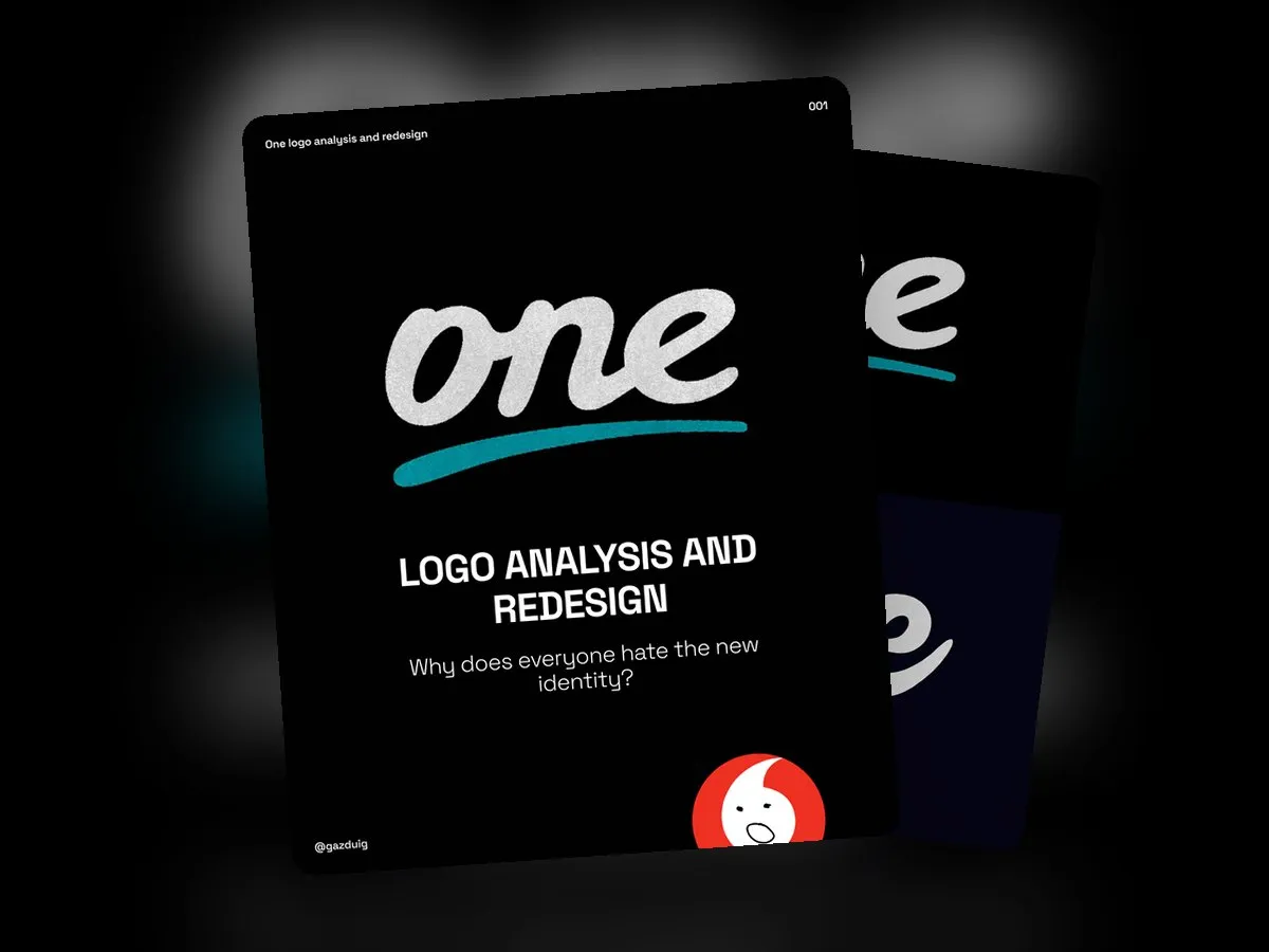
The brands that had long operated in Hungary as Vodafone and Digi merged and continue under the name One. The former consumer and small business services took the One name, and the business services are sold as One Solutions.
In a change of this size, the fate of a logo is often shaped by what people think of the company and the decisions behind it. If someone already has a negative opinion, they will look for confirmation in the logo too and see the smallest flaw as proof. That is why it is worth separating the feelings from whether the logo does its job.
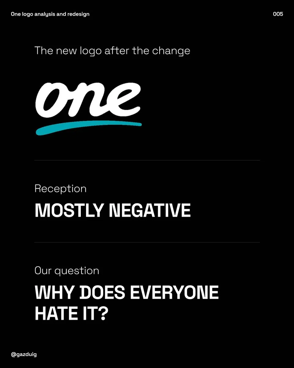
2. First impressions
Honestly, my first thought was that yes, this really is not the strongest logo, and it also reminds me of the logo of Nosalty, a popular Hungarian recipe site. That in itself is not necessarily a problem, but it shows there is room to improve. Before passing judgement, though, it is worth looking at what the brand wanted to achieve with it.
3. What the brand promised
According to the launch materials, they set out to design a people-centred brand. The logo imitates handwriting and underlines the name with a sweeping line, the way many people underline their signature. The brand wants to be about making connections more than about cables and complex digital solutions, it wants to be playful and open to change, and recurring doodles in its content give it a personal touch.
Looked at this way, the logo delivers most of what was promised.
- It feels playful and friendly.
- It has character and personality.
- The handwriting and the underline make it feel human.
- The joined letters reflect the idea of connection well.
- It turned out completely different from its predecessor, so it really is not afraid of change.
- The doodle motifs bring the look to life.
4. Uniqueness and competitors
So is the logo terrible? I don’t think so. It stands apart from its competitors, Telekom and Yettel, and meets most of the criteria. Its weak point is uniqueness, because it resembles a generic handwritten typeface that anyone can use.
The idea of handwriting and a signature is fine. The explanation of the underline feels to me like an afterthought, as it makes the look more exciting yet adds little to what the brand wants to say. The values listed really call for a handwritten letterform, it just needs a little extra so that it does not feel like a copy, and the underline could also play a stronger role.
The competitors have no logo icon, so One could have one, but in this exercise I assumed the wordmark stays.
5. A quick redesign
We started with free and paid handwritten typefaces from dafont.com and Envato. We put nine versions side by side, chose the best one and set the rest aside.
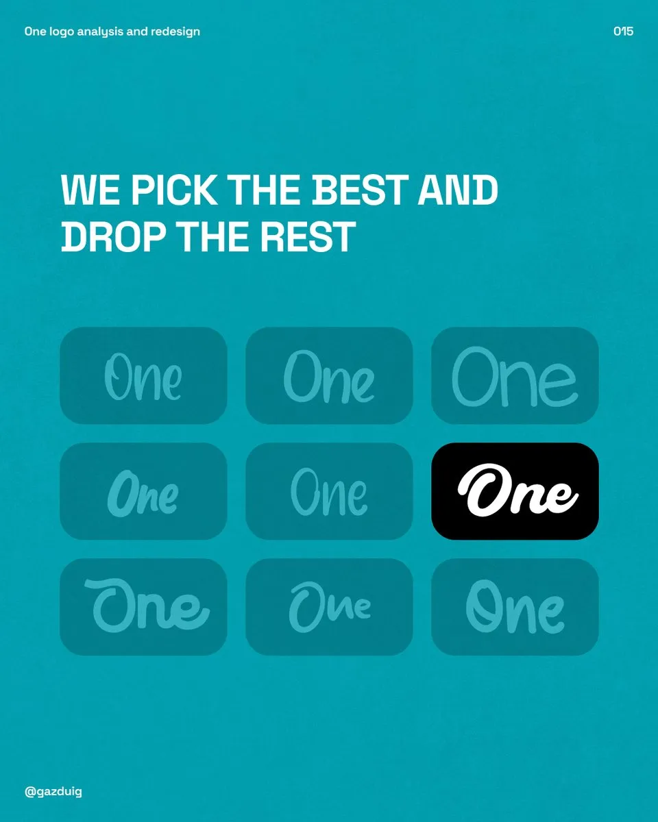
We then adjusted the chosen letterform a little. The thicker, bolder form keeps everything that is good in the original while giving it a steadier look. The letters are still joined, and the underline became a friendly smile, freely inspired by the Amazon logo, since few things create a connection better than a smile.
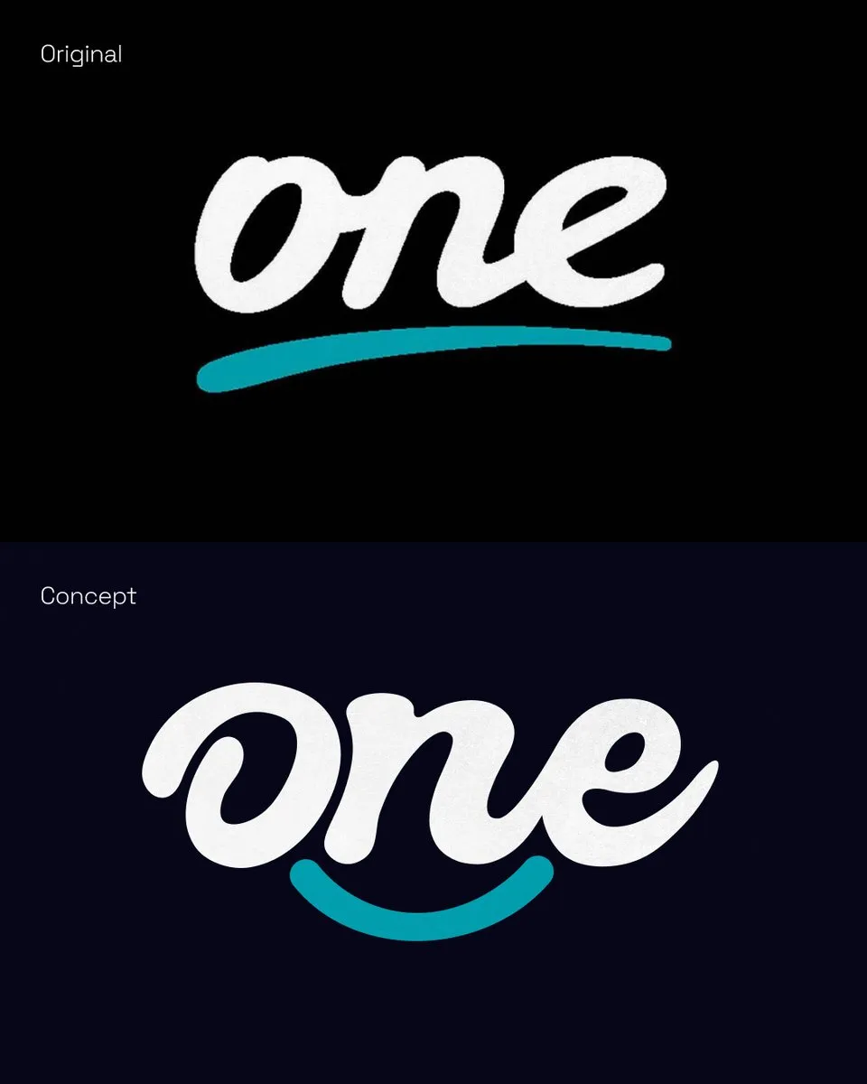
I would not call this a full redesign, more of a version 1.2 draft that shows where the idea could be taken further.
6. Saying goodbye to the old brand
A change like this affects many people and fundamentally transforms something they have been attached to for years. In such cases it is worth paying more attention to the transition and to letting go. Even if nothing remains of the old elements and ideas, customers who liked the previous brand will appreciate a decent farewell, so alongside “what comes next”, the communication should also make room for “what came before”.
I see all this from the outside, from publicly available information, so these are subjective observations. If your brand is also facing a change, we have written separately about choosing between a rebrand and a refresh.