1. The problem to solve
According to the feedback, buyers loved the product, its quality and the design of the blender. From the box, however, many would never have guessed it held such a high-quality product. When that happens the packaging works against the product, since the box is what the buyer meets first and often decides on.
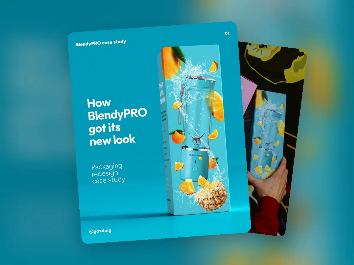
So the goal had two parts. The box had to suggest the same quality that the product inside represents, and it had to bring back the fruitiness that blending is all about.
2. What makes a box feel premium
With packaging, the sense of quality never comes from a single element. The imagery, the colours, the typography and the print finish together decide whether a buyer sees a premium product or a cheap alternative. If even one of them clashes with the others, the whole box loses credibility.
For a product that is also sold online, the box appears in product photos and unboxing videos too, so its impact reaches far beyond the shop shelf. That is why it is worth designing it to stay recognisable as a small image viewed on a phone.
3. What we knew about the product and the buyers
The heart of the brief was a stylish, portable blender that stands out from similar products through its quality.
There are more women than men among the buyers. They include athletes and hobby athletes, bodybuilders, parents of young children who make purées with it, and most importantly people on a diet. Their challenge is partly losing weight or sticking to a diet, and partly that, as overstretched parents, they want a simple and quick solution for everyday life.
We also looked at which brands and faces they come across every day, because the box has to hold its own among them. If a buyer sees the product next to their favourite sports brands, the packaging has to fit into the same world.
4. Steps of the process
- Assessment. We got to know the problem, the brand’s personality and the target audience.
- Joint ideation. We discussed our ideas in person and put together the moodboard.
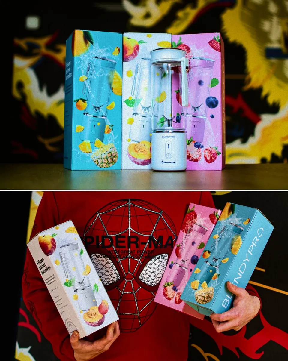
- The first box. Based on the moodboard and the information we gathered, the design of the first box was made, followed by the other two.
- Prepress. Finally we prepared the finished designs for print.
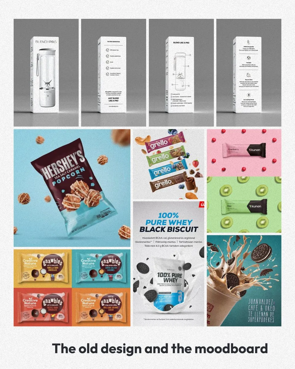
A moodboard helps a lot in this process, because even before the design starts it gives everyone a shared picture of where we are heading. It is much easier to agree on a mood on a board of images than to start over on a finished design.
5. The result
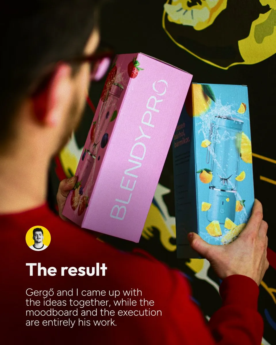
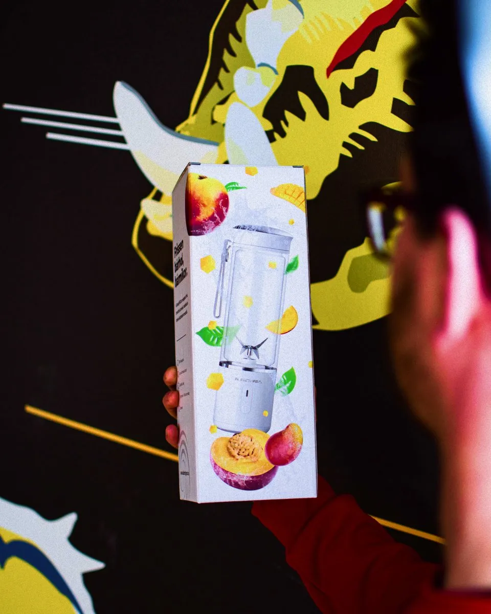
Two of us took part in the ideation, my colleague Gergő and I, but the moodboard and the execution are entirely his work. The boxes give the leading role to the blender and to lively, fruity imagery, so the packaging finally promises what the product can do.
6. When to revisit your packaging
If buyers love your product and the feedback is good, yet you feel more people could be choosing it, it is worth checking what the box says. Packaging is the product’s first introduction, and if it says something different from the product itself, buyers will believe the packaging.
A packaging redesign does not necessarily mean a full rebrand. Often it is enough to make the product’s real strengths visible and to place the box in the world where your buyers already spend their time.
The original post on Instagram