1. Where the change started
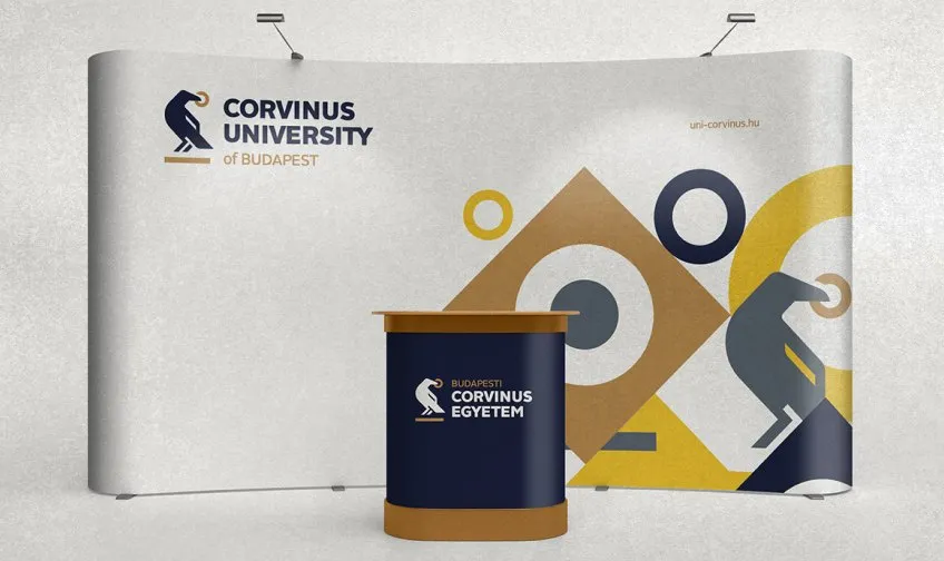
The previous identity was designed by Salt Communications. It was built on gold and dark blue and on a beautifully drawn raven within an excellently composed logo, and it won both a Hungarian Design Award and a Kreatív RGB RED grand prize, in my view fully deserved.
This matters as a starting point, because the refresh had to touch a system that students and the design community both loved. In a situation like this the biggest question is always what we keep, and only after that what we add.
2. What the refresh brought
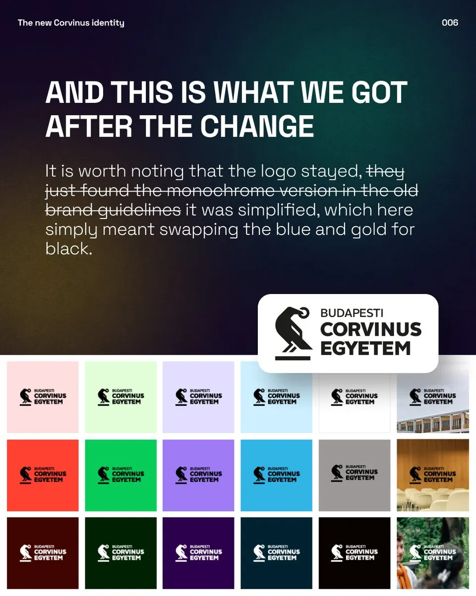
According to the university’s announcement, the goal was a more visible presence in Hungarian and international higher education, and the new colours were meant to connect freshness and curiosity with the values of knowledge and tradition. The announcement also said that the new visual identity did not replace the logo, it only simplified it.
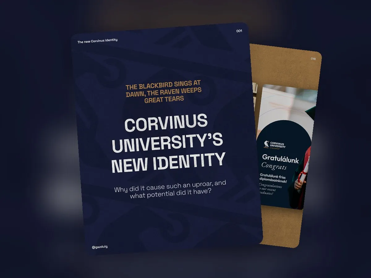
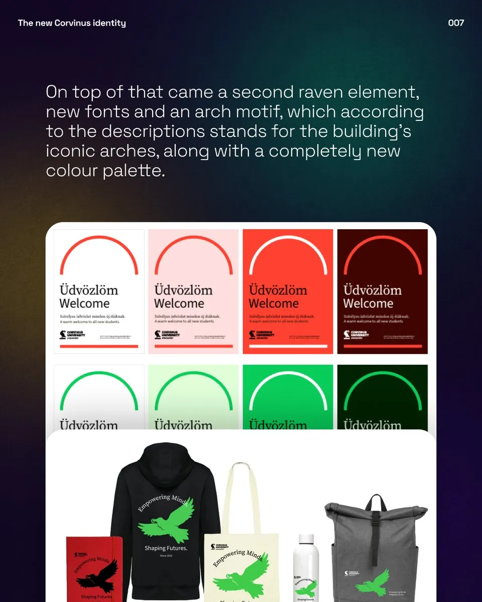
In practice the simplification meant that the shape of the logo stayed while black took the place of the blue and the gold. Alongside it came a second, simpler raven, new typefaces, an arch motif inspired by the arches of the building and an entirely new colour palette.
According to the university, the new identity was created by an international design agency whose name was not made public. The images shown here come from the university’s own channels, the uni-corvinus.hu website and its social media accounts.
3. Where it may have slipped
The descriptions say that the new visual directions were based on market research, on the opinions and comments of the people involved. Research is a good starting point, and the real question is who was asked. Judging by the strong reactions, I suspect that the voices of those who use and wear the university’s identity every day carried less weight in the decision than they should have. This is only an assumption, as from the outside this is all one can see.
Personal taste is one thing. With an identity, what matters more is whether it does its job, so I went through the elements one by one and measured them against the goals set out in the announcement.
4. Element by element
- Typefaces. The modern Source Sans 3 can stand for initiative and the serif Source Serif for tradition. The idea is sound, though such a widely used pair gives a university little character, and a more exciting type family would have made more of it.
- Colours. Expanding the palette is a great idea, yet the chosen colours are bland and recall the default colours of office software, while the gold and blue pair that worked so well and that many people loved has disappeared.
- The arch. The Corvinus building really is full of arches, so the idea is good, and it gives the materials a frame and a consistent look. The previous identity could have carried the same element as well, and the execution had more potential.
- The second raven. In my opinion this is the weakest element. It hardly resembles a raven, its form and line work are weak, it looks like stock art, and it does not suit the character of the logo that was kept.
5. The verdict
Looking behind it, the majority’s feeling unfortunately holds up from a professional point of view as well. Compared with its predecessor, the new identity is a step back that feels unconsidered and generic, and it does not reflect the thinking that was set as the goal at the start of the design process. The elements many people loved and respected are gone, and in their place came changes nobody had asked for.
In our analysis of the One identity I wrote that the reception of a rebrand is often coloured by what people think of the company. I believe this case is different, and here the criticism is aimed at the identity itself.
6. What we would have done
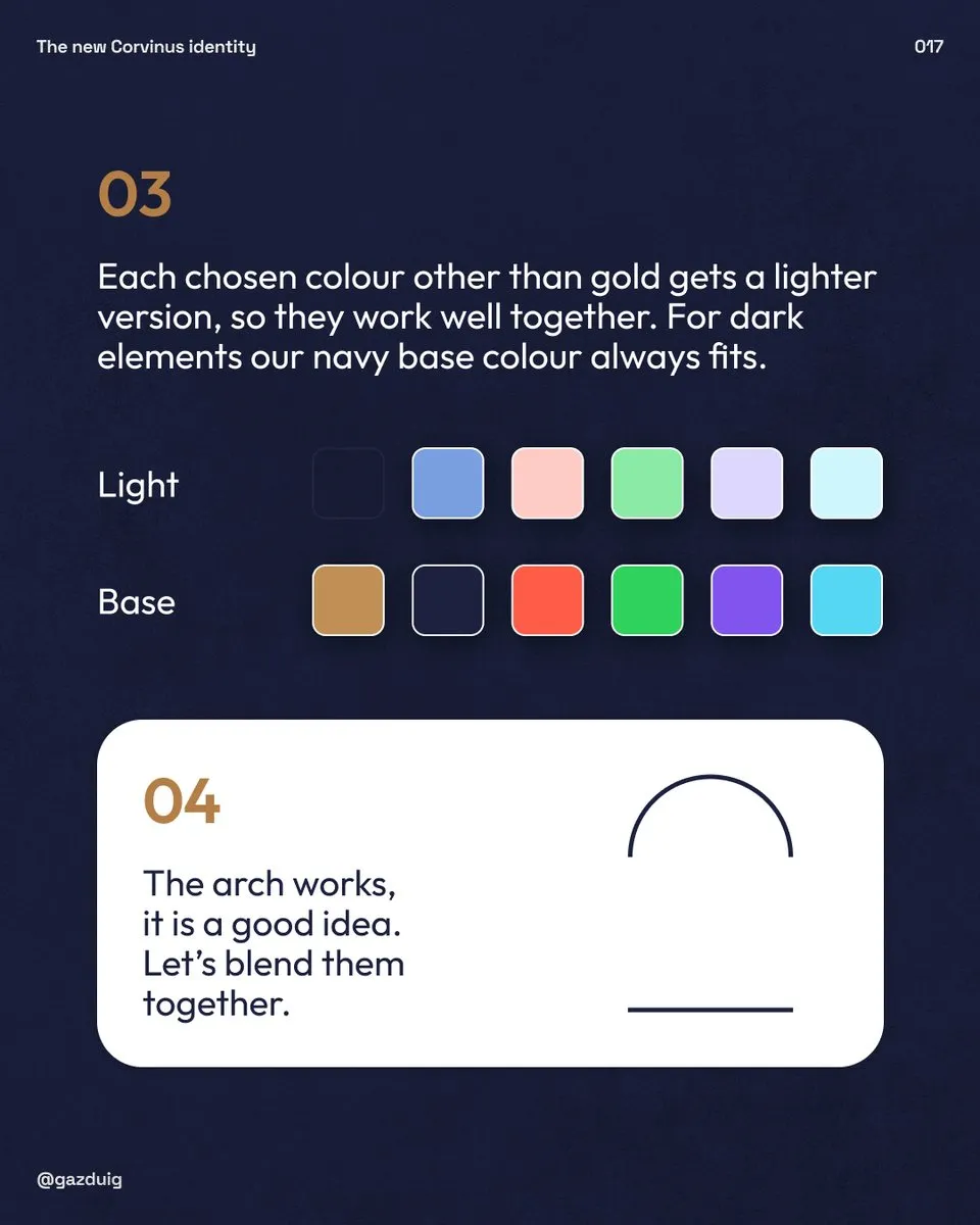
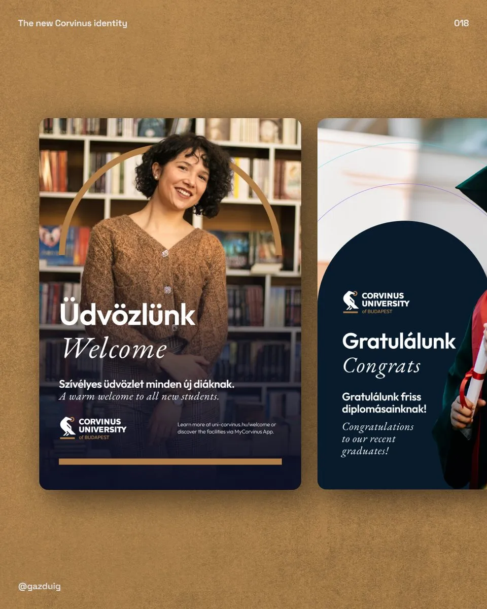
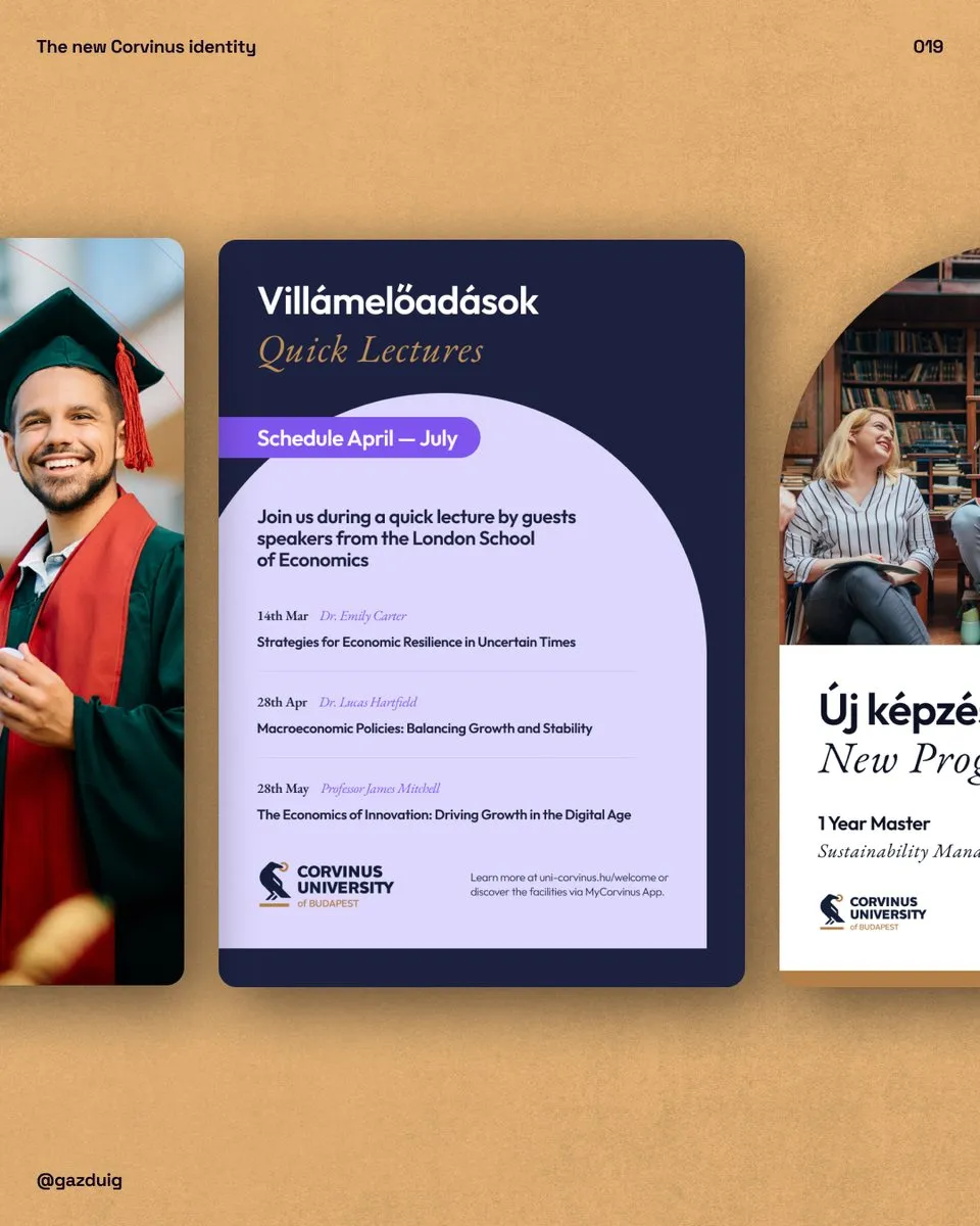
Our redesign was built on that single principle. The logo and the gold and dark blue base colours stayed, because they carry the tradition and make the university recognisable. We brought something new with the supporting colours and the typefaces, and we kept the arch motif because it is a good idea, we simply blended it with the old elements.
For type we chose two highly legible families that work well together. EB Garamond partly represents tradition, and Outfit the modern side that stands for initiative. The supporting colours are part of the identity without being its main elements, they leave room for new directions, and every colour apart from the gold got a lighter pair so that they work well together. Dark elements are always paired with the dark blue base colour.
The samples below came out of that system, including welcome and congratulation posters and announcements for a new programme and a lecture series. The aim was for the renewal to show while students still recognise their own university in it.
7. What to think through before a rebrand
When you renew a well-known and well-loved identity, a gradual refresh almost always works better than a complete change, and the research should include the people who live the brand every day. If the audience is attached to an element, dropping it needs at least as much explanation as introducing the new ones.
If your brand is also about to be renewed, we have written separately about choosing between a rebrand and a refresh, and we are happy to go through with you what your audience holds on to.
The original post on Instagram