1. After ten years
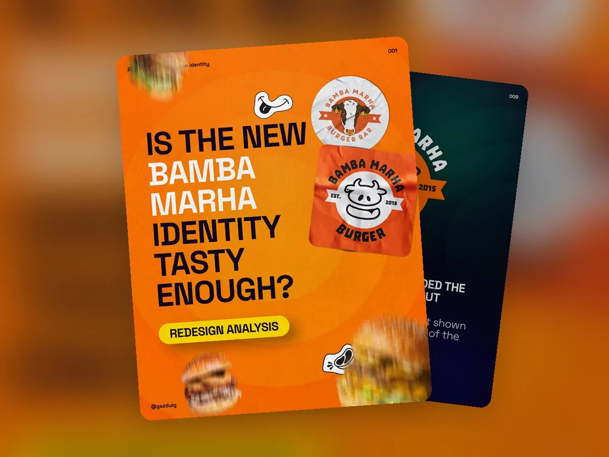
Bamba Marha, a Budapest burger chain, turned ten, and alongside the festive mood the occasion also showed that the brand was ready for a refresh, so that it could hold its own for the next ten years too.
The biggest problem with the old logo was responsiveness. It had a lot of detail and was essentially a beautiful drawing, which could not be used well at a small size or in one colour, for example as an LED sign. For a restaurant chain this is a serious issue, since the logo has to work just as well on the shopfront as on a napkin.
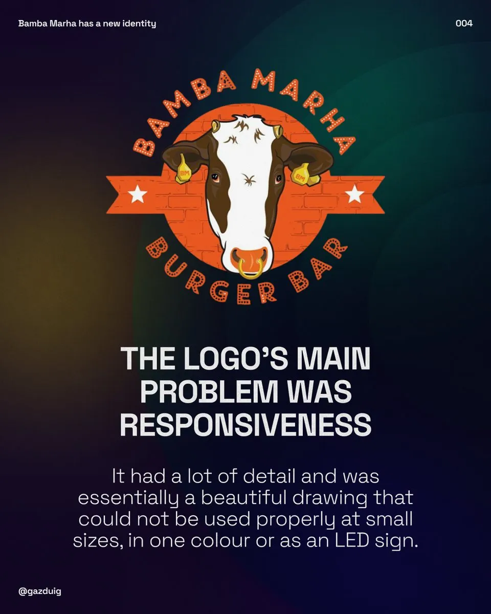
2. We started from an existing concept
It is important to note that we did not start from zero. The Bamba team came to us with a concept that no longer carried the problems of the old logo but was not yet ready to launch, so that is where our thinking began.
First we checked whether the head was bamba enough and marha enough, which in Hungarian means roughly goofy enough and cow enough. The answer to the first was yes, to the second no. We reworked the proportions, the ears became smaller and rounder, which made the head more cow-like, and we resized the earring, because it still gives the character its personality. Later it turned out that the horns were not quite right either, and their new position meant reworking the ears and the earring once more.
3. The tenth round
In the end the outlined version was chosen, but there the lines sat too close to each other. When we merged them, the bottom became too heavy and the dripping cheese was lost.
This started a frantic round of experiments. We needed a form whose lower part was angular enough yet had soft edges, showed the dripping cheese or the tongue, had the right line weight, and did not make the bottom look like a hefty sausage.
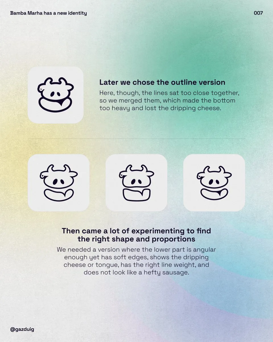
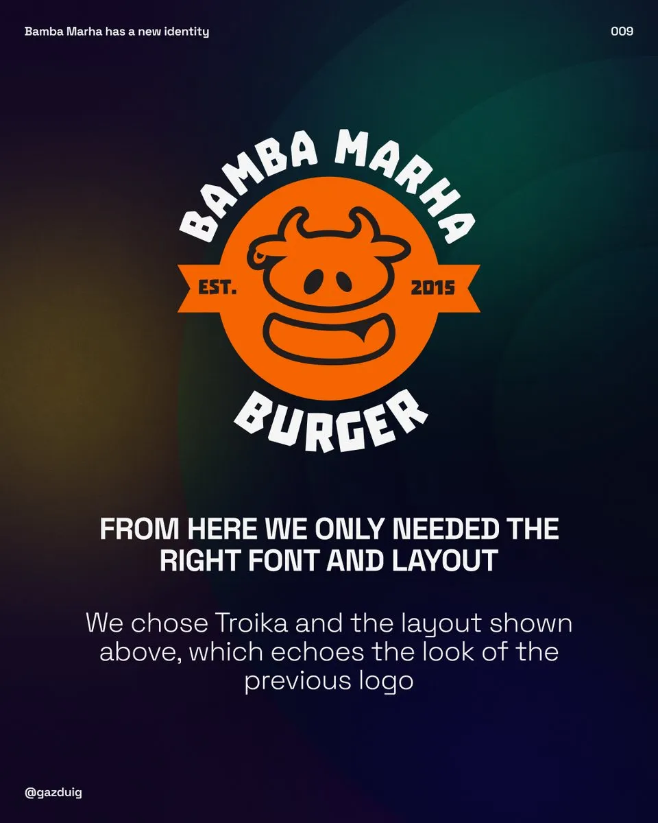
Finally the version everyone agreed on was born. We do not know exactly in which round, but for the sake of the magic let us say it was the tenth. From there only the typeface and the layout were missing. We chose Troika and a layout that echoes the look of the previous logo, so that regulars recognise it straight away.
4. One look across eleven locations
The real design work only started after this. Managing eleven restaurants is not easy, and neither is looking consistent across eleven different locations, so our most important task was to create that consistency.
The menu got the most attention, because understandably a lot depends on it. The menus of the eleven restaurants overlap a lot, yet each has its own particulars, and the main challenge was making the information easy to take in. Once we received the updated menu, we went through the categories from the monthly special through the burgers and sides to the drinks, and each got its own look so that they stand apart clearly. In several places we built the meaning of a block into its form, so the monthly special, for example, looks like a calendar.
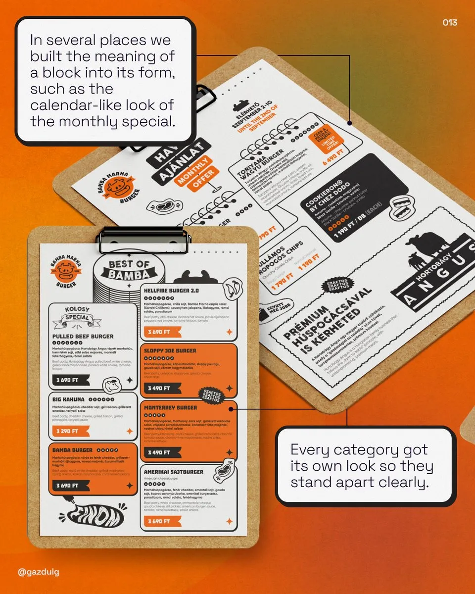
Bamba had always been full of illustrations. We refreshed them in a flat sticker style and used them to fill the empty spaces. We made sure everything also appears in English, and eleven stars run across the top of every page, one for each restaurant. In several places we built the text into illustrations, and our favourite extra stickers were made in a half filled, half outlined style that suits the brand well.
5. Screens above the counter
The TV menus were renewed too, in a similar way to the printed ones but relying much more on photos, because many orders are decided on these screens. In the Bamba restaurants they also run in an animated version.
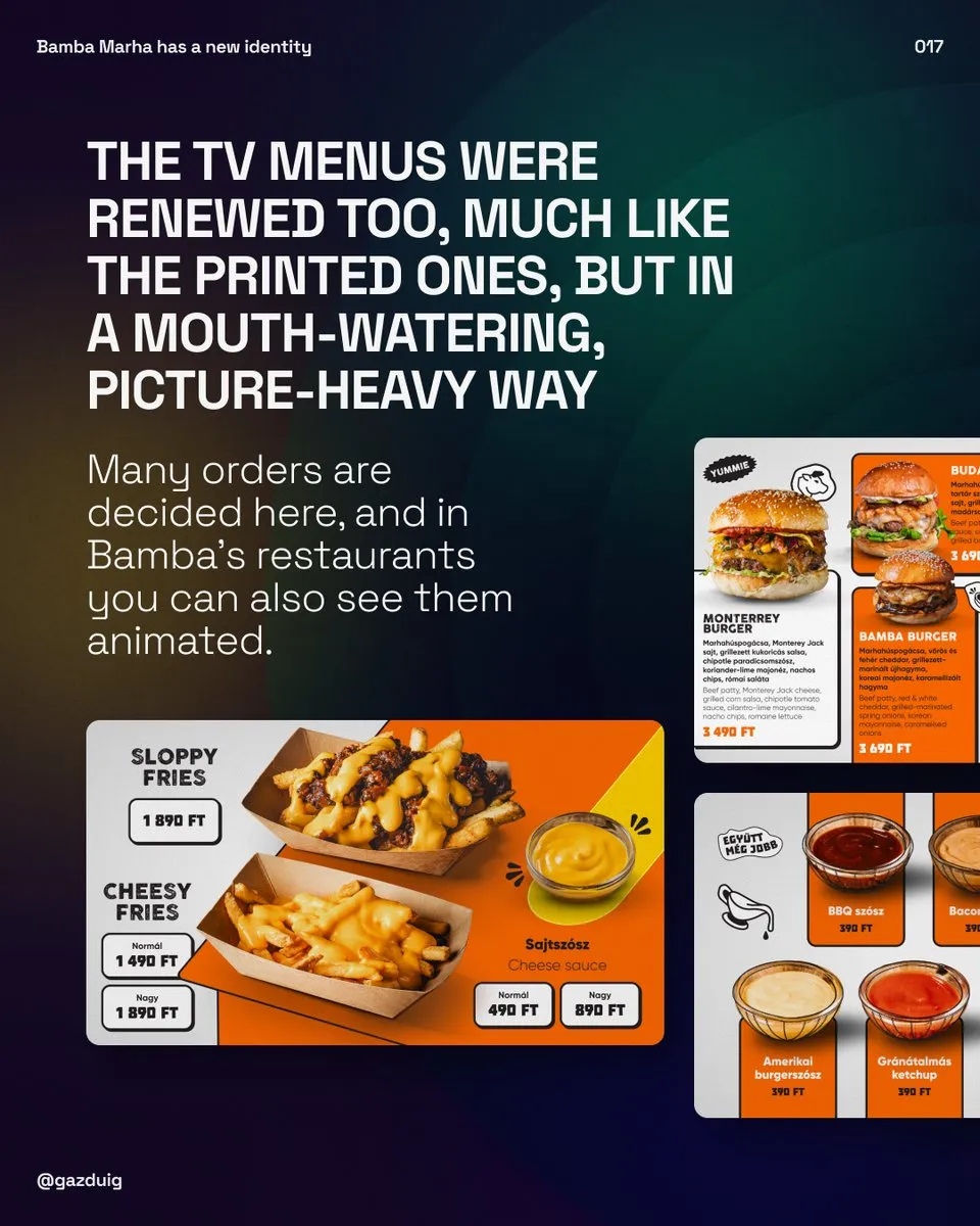
Many more materials were made, and you can discover them at the restaurants. Everything that shows the new logo and similar elements is already part of the new identity.
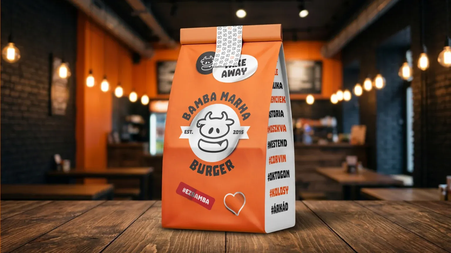 Bamba Marha rebrand and campaign We show the full rebrand and the campaign made for the tenth birthday in the case study. See the case study
6. The lesson
For a well-loved brand present in many locations, the logo is only the beginning. Most of the work lies in making the system behave the same way on every surface, from the smallest sticker to the screens, so that guests feel the same brand everywhere.
This time we are not the ones passing judgement. If you are in Budapest, sit down in a Bamba Marha and see for yourself how well it turned out.
The original post on Instagram