1. What we look at, and what we leave out
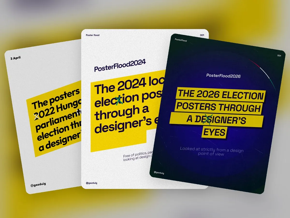
I only name the parties so you can tell which poster I am talking about. The assessment does not touch the content of the messages or the candidates. It only looks at how photo and typography work together on a surface most people walk past in a few seconds.
From the campaigns of the 2022 parliamentary, the 2024 local and the 2026 parliamentary elections I went through the posters I came across or that people sent me, so the selection is incomplete in every year.
2. Lighting the photos
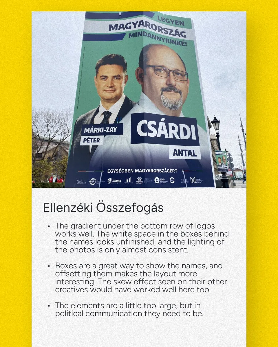
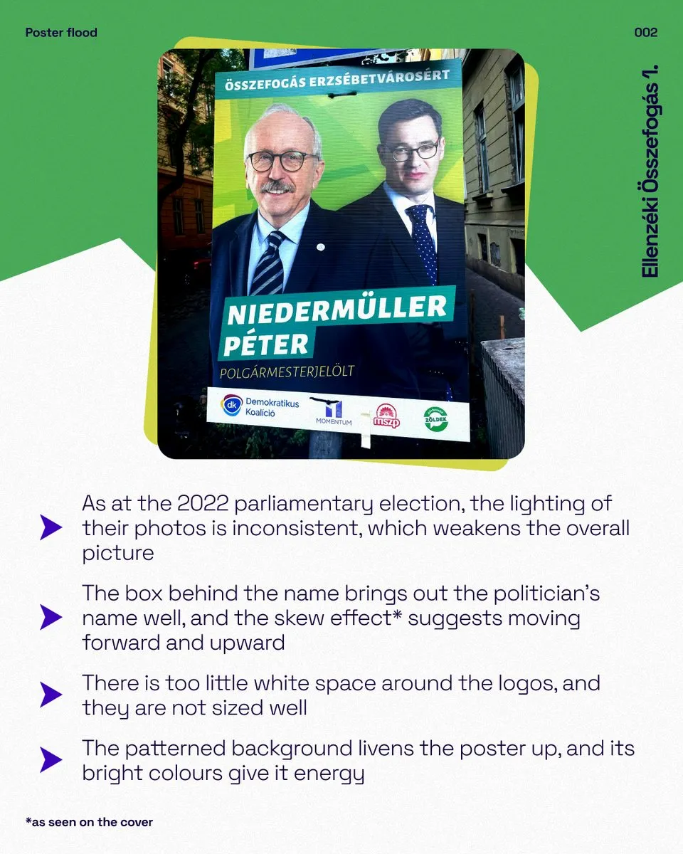
The most common recurring problem across all three campaigns was the consistency of the photos. In 2022 the lighting of the photos on the Ellenzéki Összefogás posters was only almost consistent, in 2024 the same problem spoiled the overall picture, and on the K.E.J.V. poster both the lighting and the resolution were weak. Where two people stand side by side this is especially noticeable, because the eye immediately compares the faces.
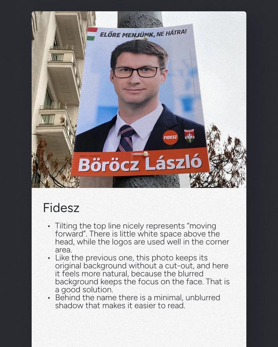
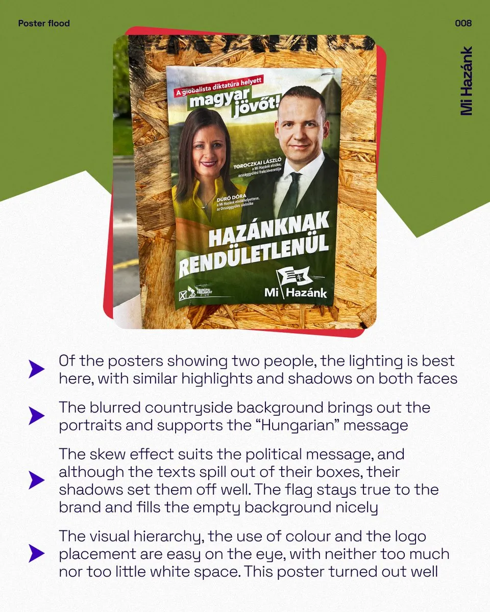
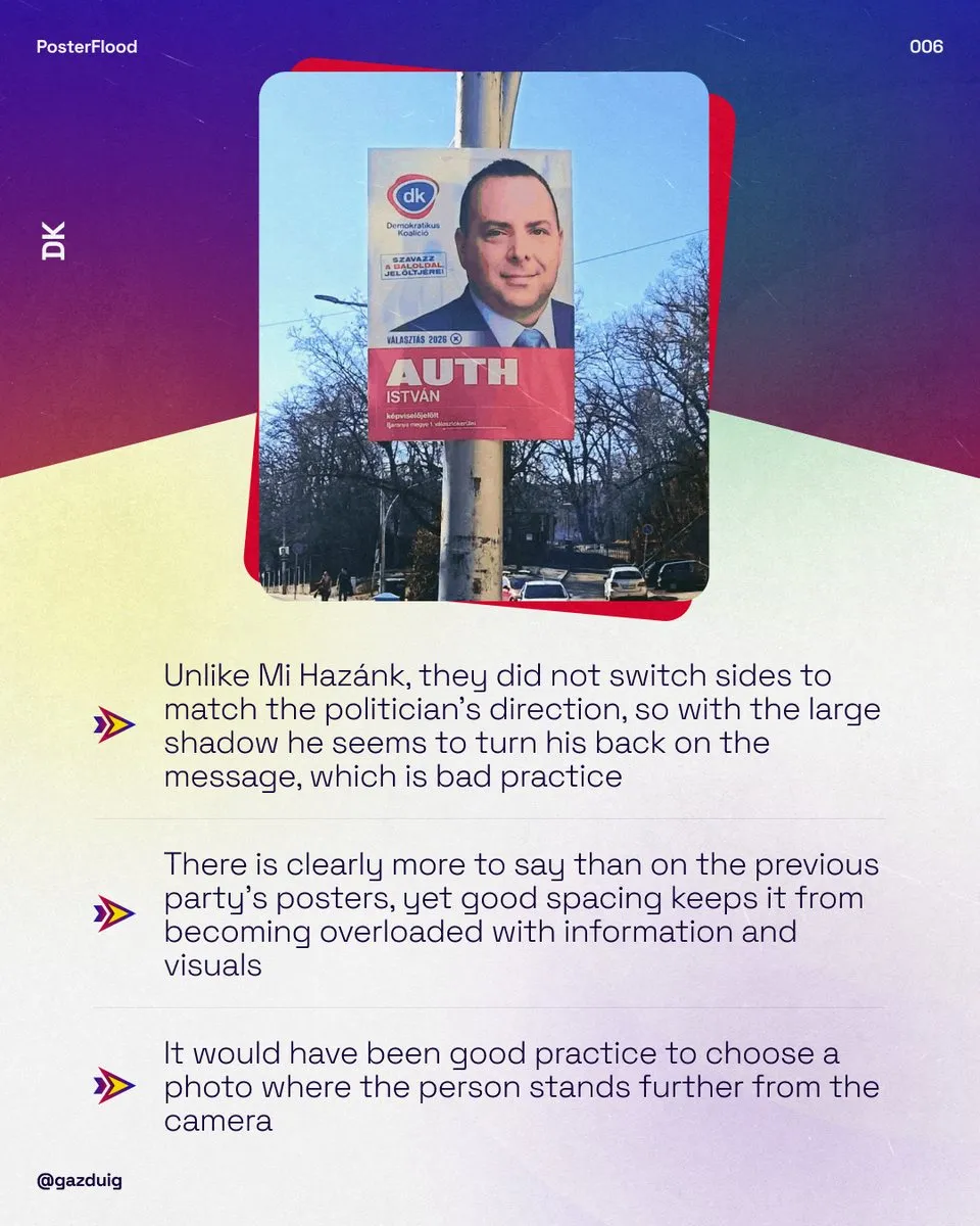
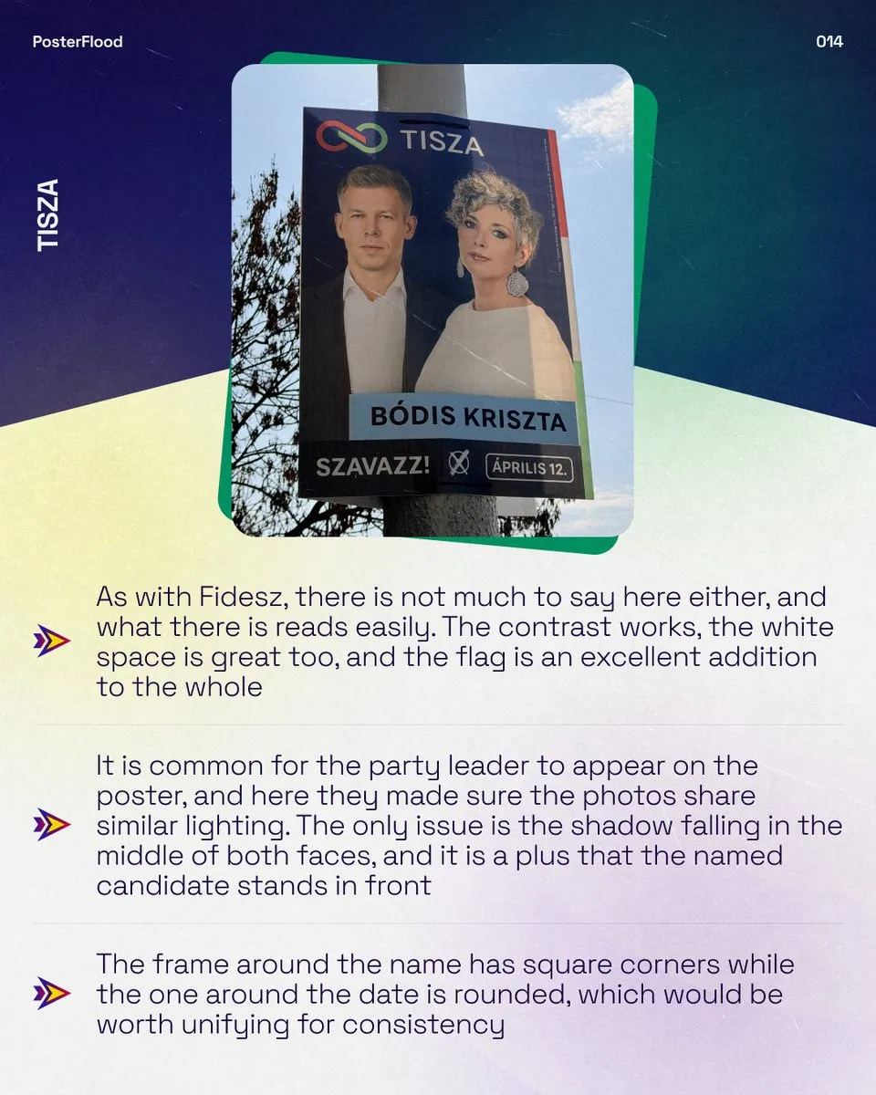
There were good examples too. On the 2022 Fidesz poster the original background of the photo was blurred, keeping the focus on the face, and in 2026 they used evenly lit photos where the people stood at a proper distance from the camera. On the 2024 Mi Hazánk poster the highlights and shadows on the two faces were similar, and the 2026 TISZA posters also paid attention to matching light, with only the shadow in the middle of the faces looking less consistent. The DK posters in 2026 were shot too close, and a wider frame would have looked more natural.
The 2022 Megoldás Mozgalom poster was the counterexample, with an unflattering shadow on an uncut, low-resolution photo and a background almost as sharp as the face, which drew attention away from it.
3. White space and visual hierarchy
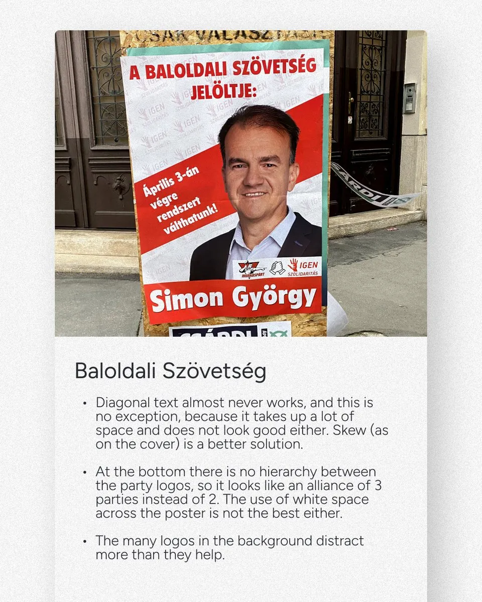
The most important question for a poster is whether the main point comes across at a glance. In 2022 the Mi Hazánk poster was perhaps the most carefully worked out graphically, but the “ELÉG” lettering did not clearly connect to the text next to it, the logo was disproportionately large, and the spacing around the name and title disturbed the hierarchy. On the Baloldali Szövetség poster there was no hierarchy between the party logos, so it looked as if the alliance had three parties instead of two.
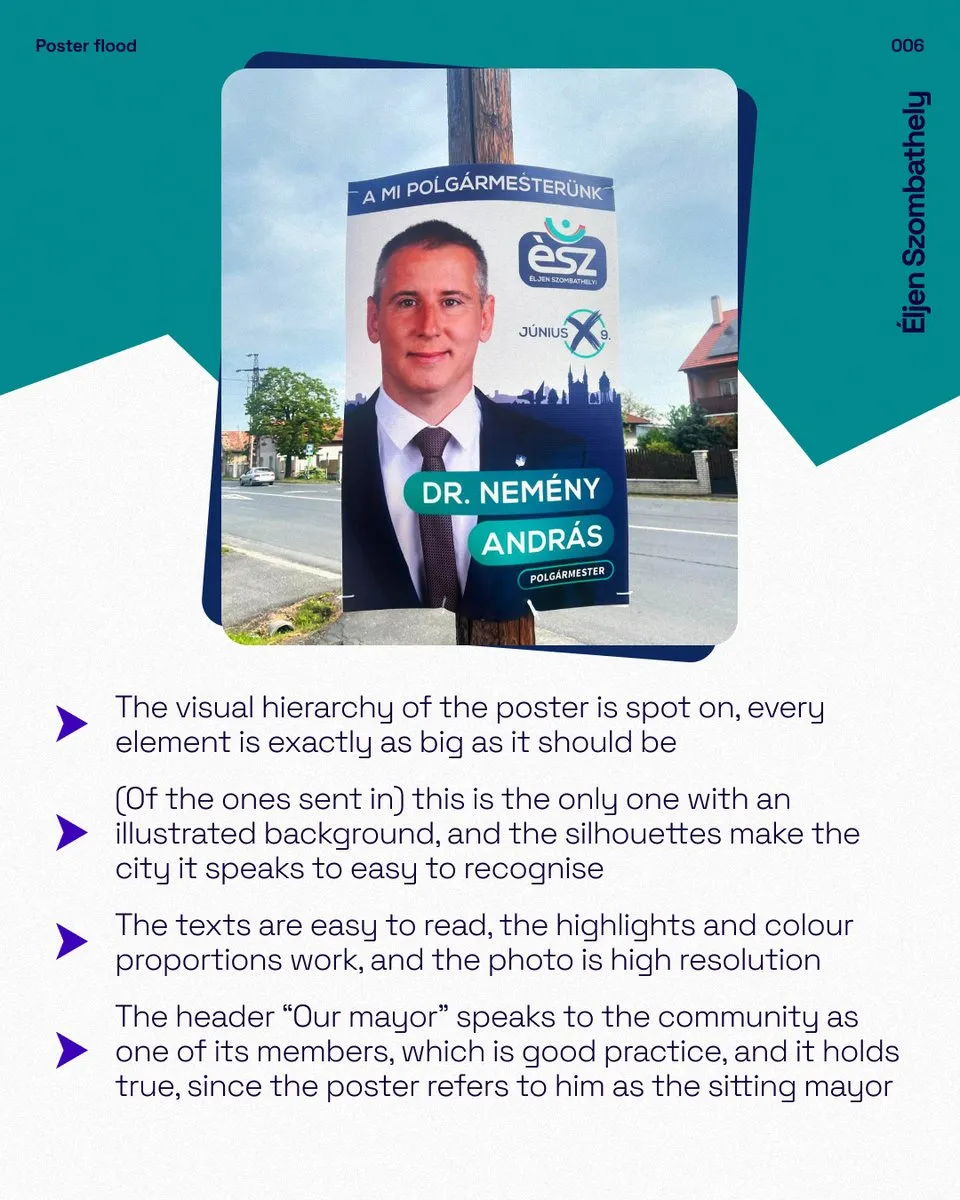
The clearest progress here came from Megoldás Mozgalom, whose 2024 poster had its visual hierarchy and white space in order, with dividing lines that filled the empty areas well. In the same campaign the Éljen Szombathely poster was the model of hierarchy, with every element exactly as big as it needed to be, and the silhouettes in the illustrated background made it clear at once which town it was speaking to.
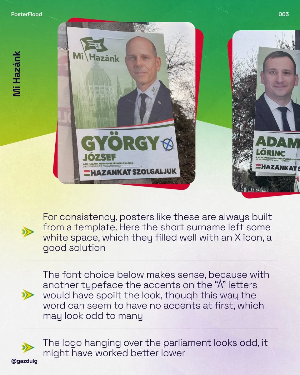
In 2026 Mi Hazánk filled the empty space next to a short surname with an X icon, which is a good solution, but where the X was missing the visual balance tipped to the left. On Bence Tordai's poster the elements were sometimes too close and sometimes too far apart, while DK arranged its larger amount of text with a good distribution, so it did not become crowded. Fidesz and TISZA worked with little text, which gave room for a clean look, and the MSZP poster left too much empty space for my taste, although it stayed consistent.
4. Slanted text or skew
A favourite tool of political communication is skew, when a text box or a band is tilted because it suggests momentum and moving forward. It is worth telling apart from text written on a diagonal, which should almost always be avoided because it takes up a lot of space and is harder to read.
On the 2022 Baloldali Szövetség poster the diagonal text failed for exactly this reason, and a text box tilted with skew would have worked better, just as the Ellenzéki Összefogás poster of the same year would have suited the skew they already used on their other creatives. On the 2022 Fidesz poster tilting the upper text expressed moving forward well, and on the 2024 Ellenzéki Összefogás poster the skew, together with the box behind the name, highlighted the candidate nicely. In 2026 the slanted text on Bence Tordai's poster again worked less well, and white and dark text of different sizes within one sentence did not help reading either.
5. Contrast and legibility
Posters are read by older people and people with weaker eyesight too, often while they are moving, so contrast matters even more here than on a screen. On the 2024 Fidesz posters the dark blue text on an orange background and the handwritten lettering in the bottom left corner were both hard to read, and on another version the middle word of the main message did not get enough contrast against the background. In 2026 the white text on yellow on Bence Tordai's poster caused a similar problem.
The choice of typeface belongs here as well. The 2024 K.E.J.V. poster used several typefaces that did not go together, while on the 2026 Mi Hazánk posters the chosen font was justified, because with another typeface the accents on the letter Á would have broken up the overall look, although in return the lettering may look as if it had no accents at first glance.
6. Where the person on the poster faces
A small thing that matters a lot is which way the person in the photo turns. If they face the message, their gaze leads the viewer there, and if they turn their back on it, the poster splits in two. In 2026 Mi Hazánk placed the person on the right or the left depending on which way they faced in the photo, so they always appeared positioned towards the viewer, while on the DK posters this swap was missing, and the large shadow made it look as if the politician had their back to the text.
It also worked well when the head overlapped the text and so linked photo and message, as the 2022 and 2026 Mi Hazánk posters showed.
7. Logos, templates and reuse
The size and position of the logos came up in every campaign. In 2022 Fidesz made good use of the out-of-the-way area for its logos, while in 2024 the logos on the Ellenzéki Összefogás poster had little space around them and were not sized in proportion. In 2026 the Mi Hazánk logo hung oddly over the parliament building in the background, the white frame around the DK logo ran over the politician's photo, and on the TISZA poster the square frame around the name and the rounded frame around the date would have been worth unifying.
Templates are good tools in themselves, because they make the posters of many candidates consistent, and the 2026 Mi Hazánk posters were made from templates for this reason. One of their layouts had appeared in exactly the same way four years earlier, with only the message and the treatment of the tricolour changed.
The MKKP posters followed their own playful brand in all three campaigns, in 2024 with a clear message and an orderly hierarchy, and in 2026 with a visually appealing, balanced layout that many may still find crowded because of the busy background.
8. What changed in four years
Putting the three campaigns side by side shows that the handling of white space and visual hierarchy improved visibly at some parties, Megoldás Mozgalom for example, and skew remained a standard tool in all three campaigns. Consistent lighting of the photos, however, stayed a recurring weak point from campaign to campaign, as did the contrast that matters so much to older viewers, even though both can be settled at the very start of the design process with little effort.
These points apply just the same to a business billboard or an event poster. If you would like your own outdoor material reviewed with this eye, we are happy to help.