 Brand
Bamba Marha rebrand and campaign
Rebrand and campaign
 UX/UI design Where your visitors never get lost.
 Brand identity So people recognise you everywhere.
 AI design review Before your customers see it.
 Packaging design That actually gets picked off the shelf.
 Paid ads That turn into customers.
 Social media That makes people stop scrolling.
Not sure what you need?
Answer a few questions and we will show you which service to start with.
Take the quizMagic Mirror is one of Sziget’s iconic venues and sub-brands, standing for diversity, inclusion and freedom in the spirit of the festival’s “island of freedom” message. Our task was to renew the Magic Mirror identity with a rebrand that keeps the well-known character of the brand while giving it a fresher, more consistent look. The work started as an impromptu pitch and grew from a logo into a complete communication concept.
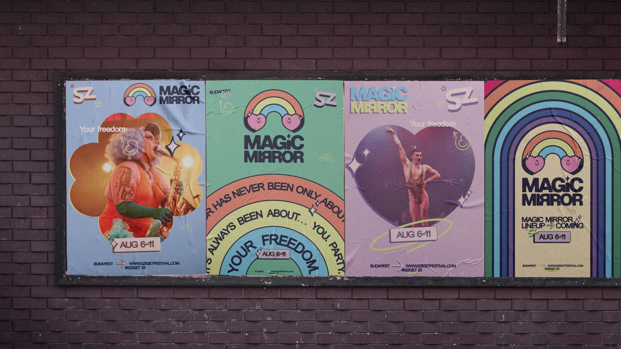
When you renew a well-known sub-brand, the biggest stake is balance. Many people know the Magic Mirror logo, so we chose evolution over revolution.
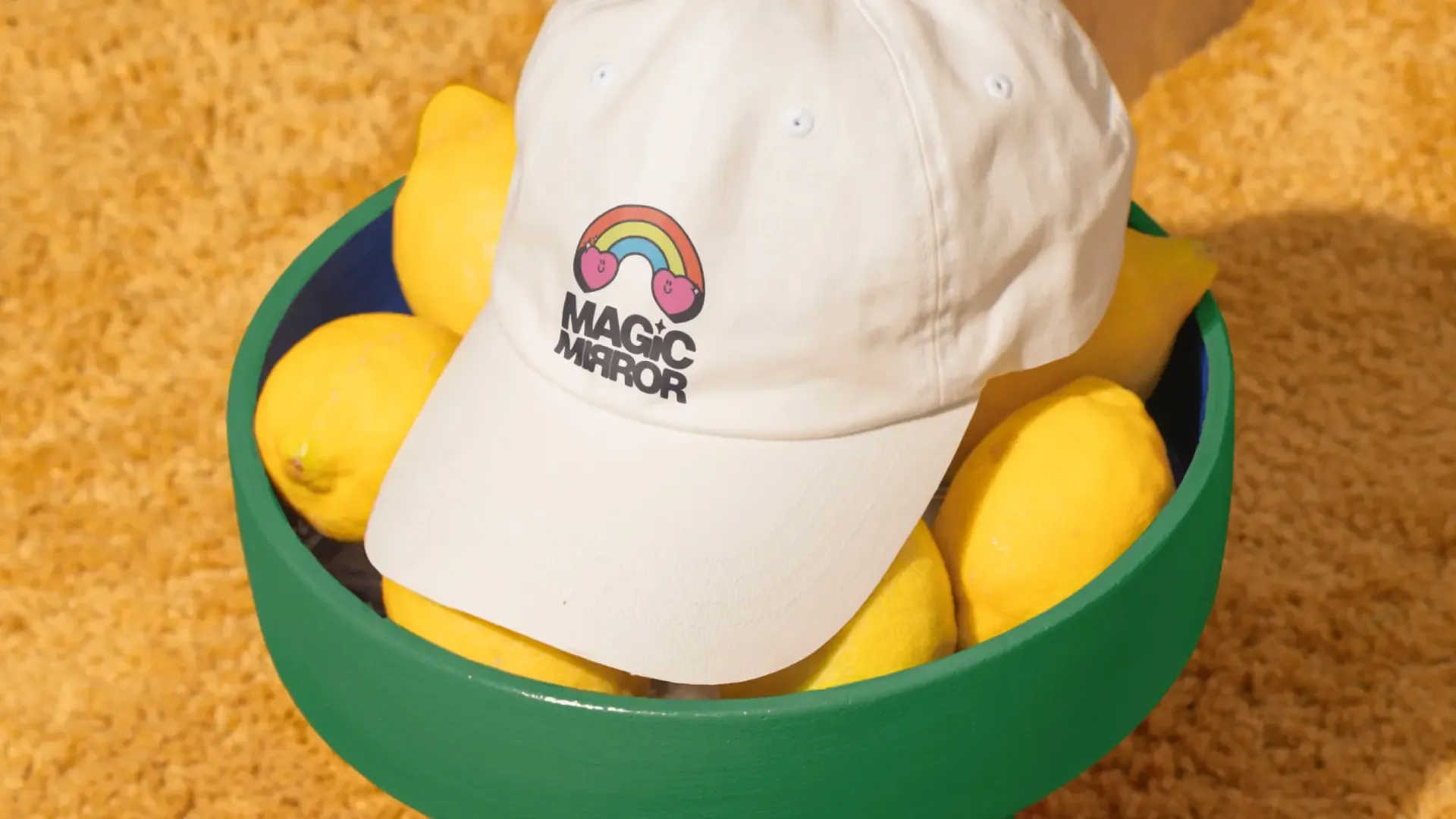
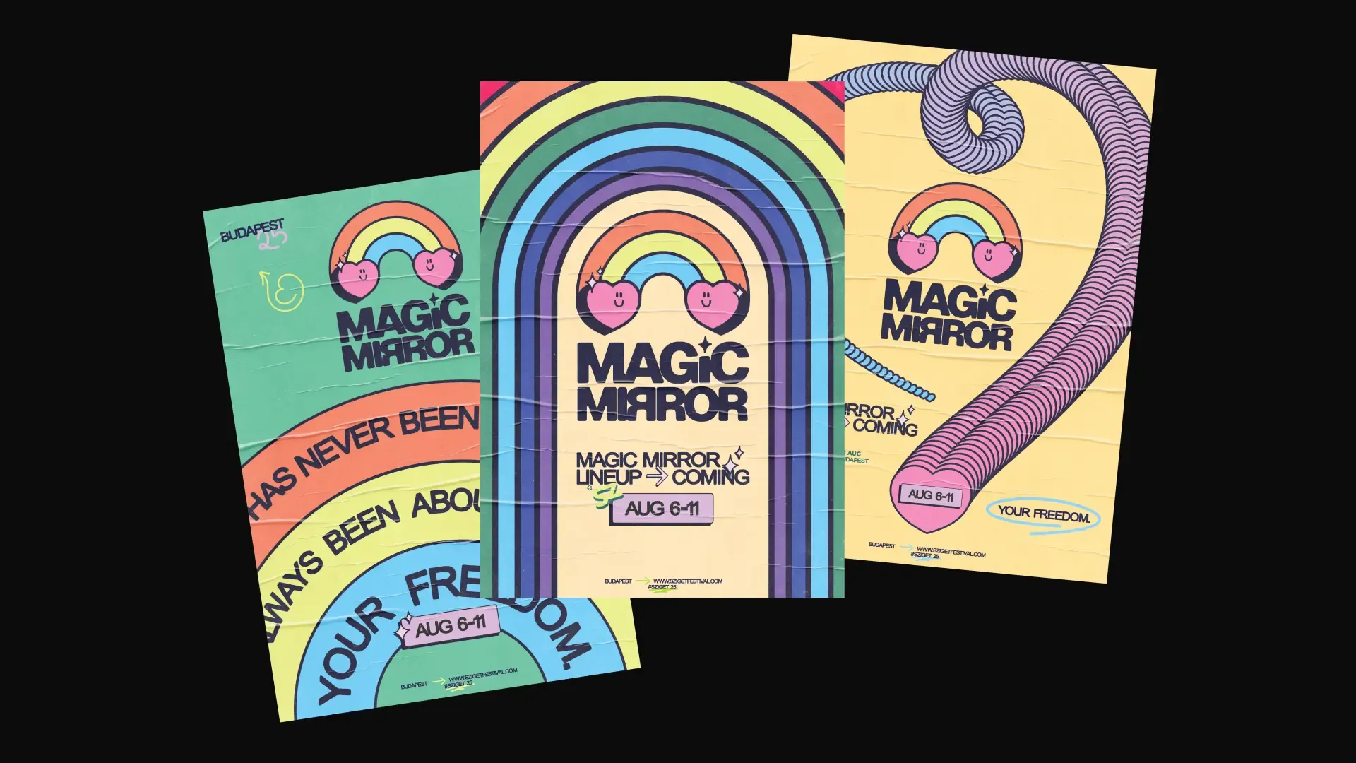
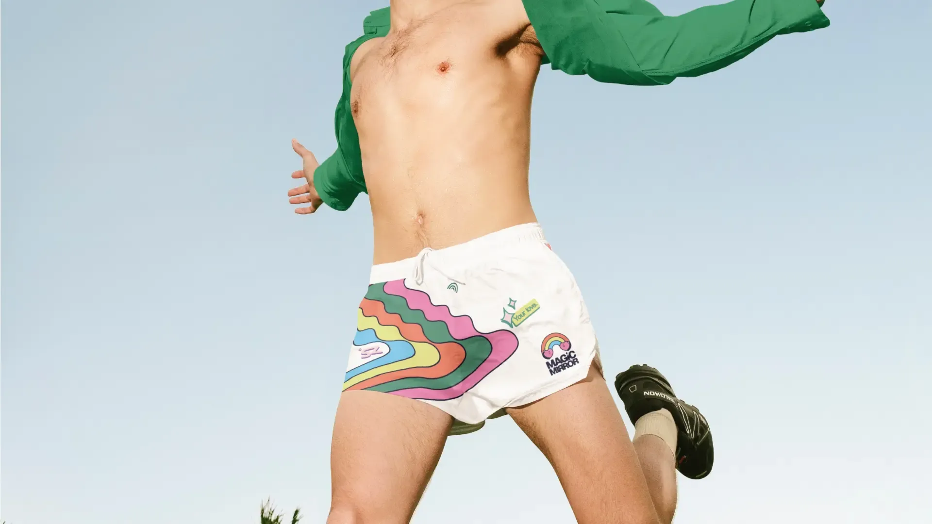
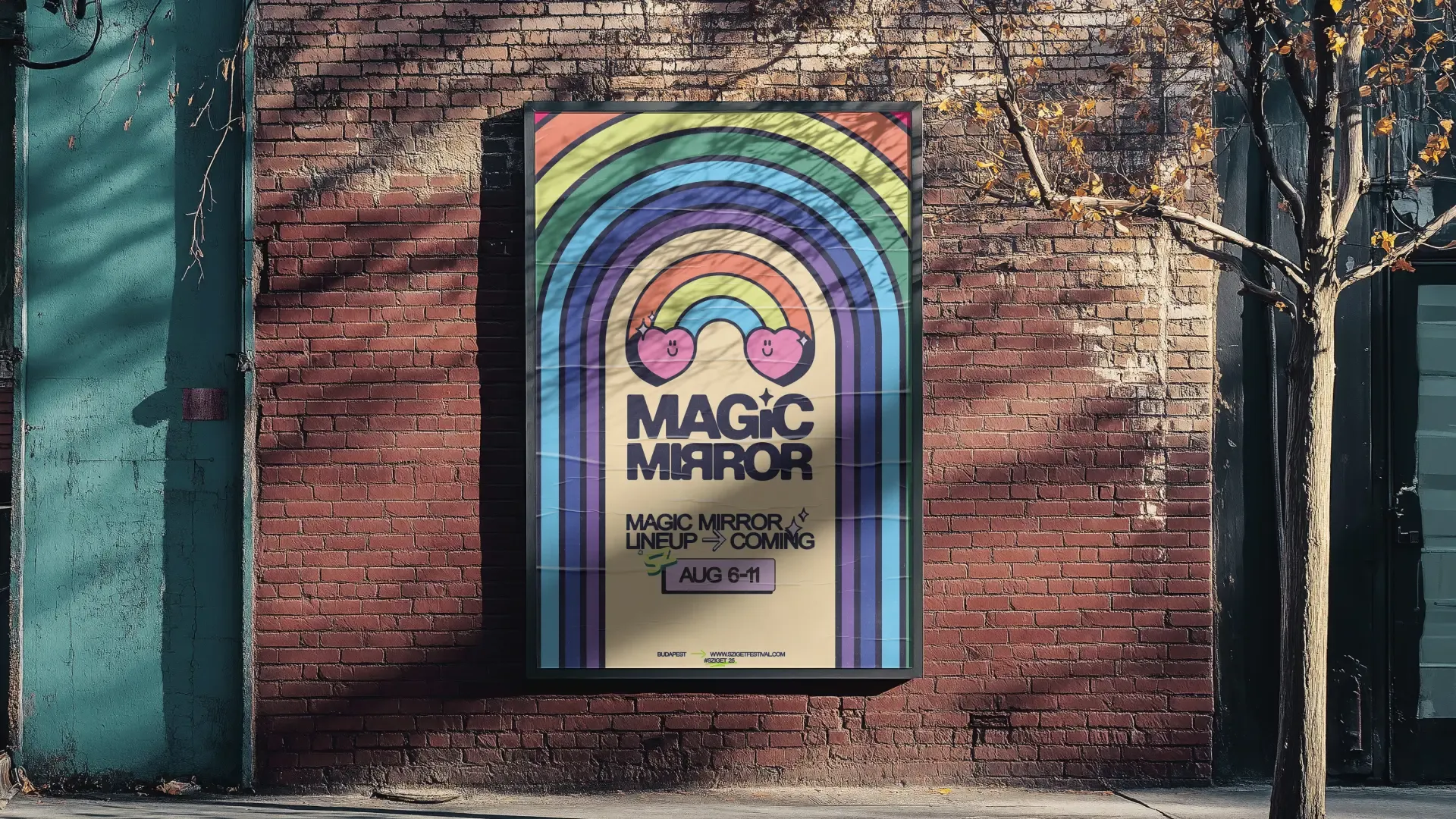

The rainbow motif had to stay so that the core message of diversity and inclusion came through as strongly as possible, yet the old typeface and colours clashed in form and palette with the identity of the Sziget parent brand. Our goal was a renewal that brings back the atmosphere of Magic Mirror, shows diversity visually, hints at the variety of the programme, and stays memorably unique while fitting precisely into the Sziget logo family.
We laid down the concept and the identity foundations, and the final materials used in communication were completed by Sziget’s in-house design team, who know the festival identity inside out, since using the festival’s visual system is far more complex than it first appears.

I'm Bence, founder of Gazduig. I answer your message myself, usually within one working day.
Cookie settings