1. What the rule says
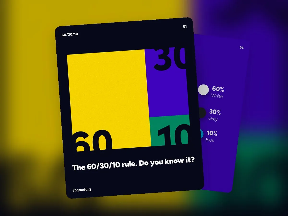
The 60/30/10 rule is one of the basic principles of design theory, and it covers how colours work together. Roughly 60 percent of a surface is filled by a dominant colour, 30 percent by a secondary colour, and the remaining 10 percent goes to an accent colour, and these proportions are what make the whole look balanced.
You may know the principle from interior design, where the colours of a room are split the same way. On screen the same thing happens. The dominant colour is usually the background, the secondary colour appears on cards and text blocks, and the accent colour sits on buttons and important details.
2. Why it works
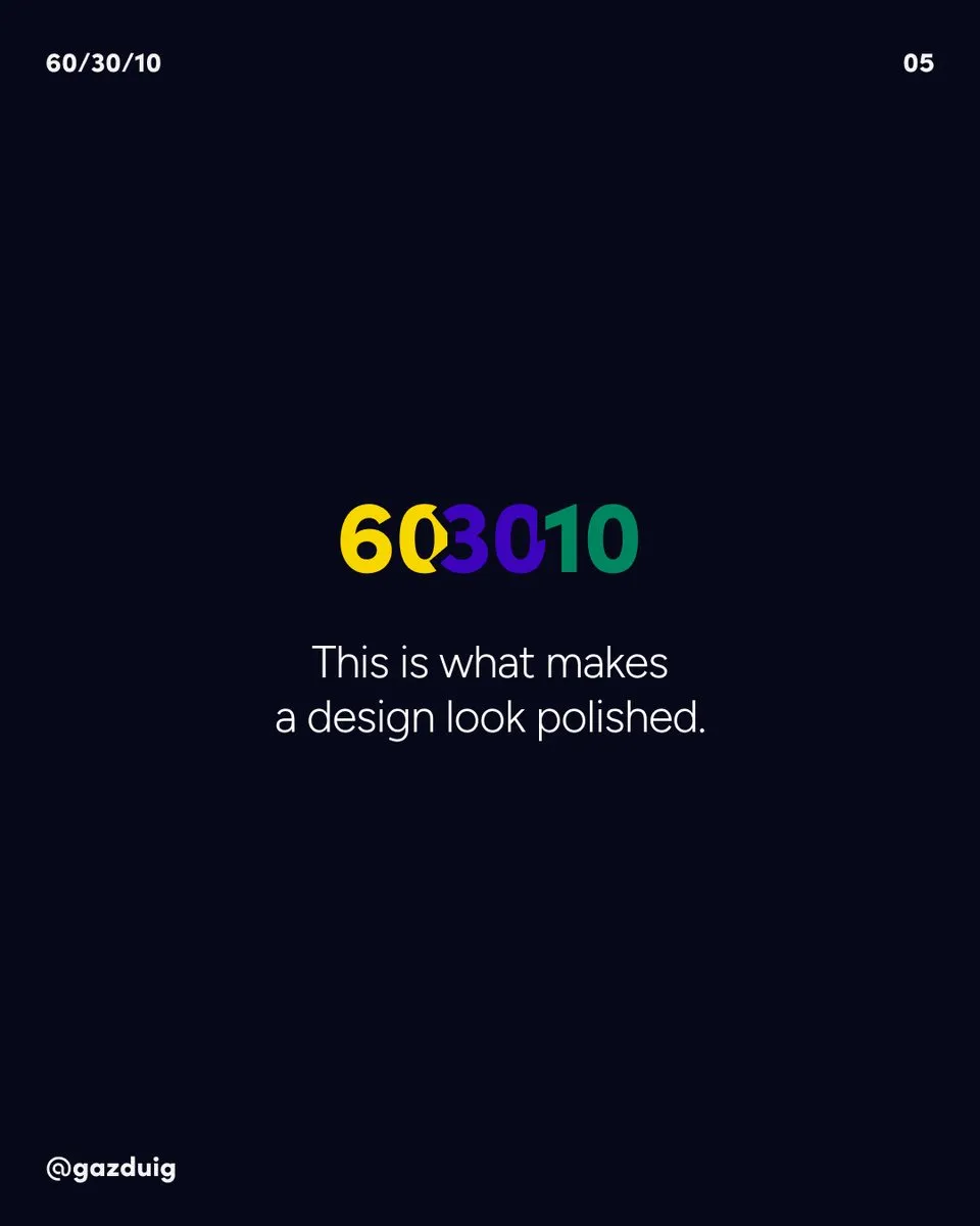
When every colour gets the same amount of space, the eye has no idea where to look first, and the surface feels noisy even if each colour is lovely on its own. Proportions create an order. Large, calm areas give the eye a rest, while smaller, contrasting spots show where the point is.
That is why the dominant colour is most often a neutral base, light or dark, the secondary colour organises the content, and the accent colour stays rare, which is exactly what lets it ask for attention.
3. The 10 percent belongs to the button
In UI design one of the most useful consequences of the rule is that the 10 percent colour takes on the role of the CTA, the button or link you want visitors to click. If the accent colour only appears on the main steps, visitors understand without any learning that anything in that colour is something they can act on.
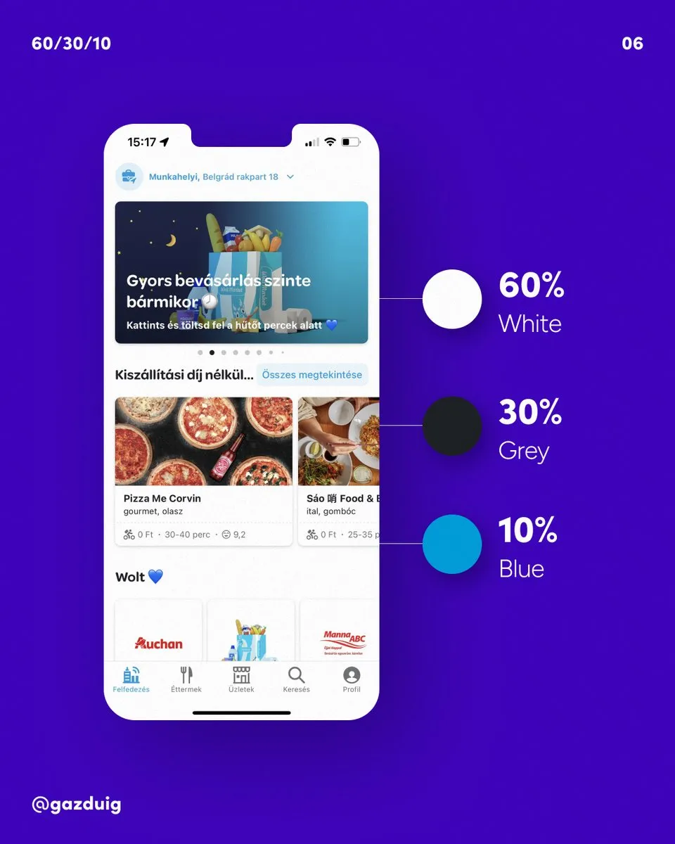
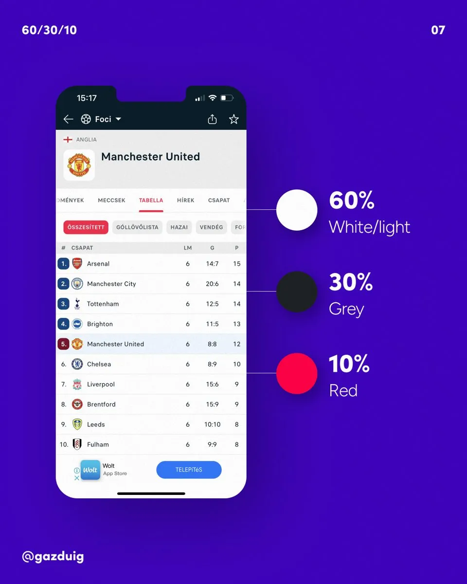
The most common mistake I see in reviews is the brand colour ending up everywhere, on the headings and icons as much as on the buttons. Then the button is just as loud as everything else, and visitors have to search for what they are supposed to do. Hold the accent colour back and the main button steps forward by itself.
4. The same in print
The rule works offline as well. A poster or a brochure also has a base that fills most of the surface, a secondary colour that groups the information, and an accent that makes the most important part, such as the offer, stand out.
With print it is worth adding that an accent colour that looks vivid on screen can turn duller on paper, so check the print colour codes before the accent goes onto an important surface.
5. Fitting it to your own interfaces
- Choose the base colour that fills most of the background, usually a light or dark neutral.
- Pick a secondary colour for cards and supporting elements.
- Make the accent your brand's strongest colour, and use it only on the main buttons and the most important highlights.
- Look at the finished design with your eyes half closed or zoomed out, and check whether the accent colour really leads your eye to what matters.
You do not have to measure the numbers to the centimetre, since the proportions work like a compass. If a surface departs from them and still works, that is fine, and if something looks crowded or washed out, 60/30/10 is a good first question for finding where the balance slipped.
The original post on Instagram